Minnesota’s flag is bad. We’re changing it.
Well, folks, I did it. It took four years and some change, but the Minnesota state government finally bent to my demand that they change the state flag.
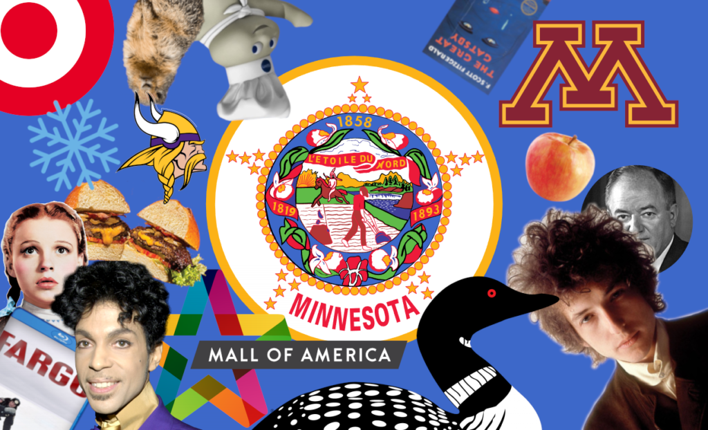
I’m referring, of course, to the piece I wrote in July of 2019 wherein I criticized the current flag of the North Star state for being ugly, indistinct, and a teensy bit racist. It didn’t do a good job of representing Minnesota, and I’ve never seen anyone proudly flying it. Even if I had, there’d be no way to know for sure at a distance whether it was Minnesota’s or one of many nearly-identical seal on a bedsheet designs.
If your memory isn’t sufficiently jogged, I’ll remind you that in that piece I put my money where my thumbs were and put forth my own suggestion for what the flag should be. Behold, the true flag of Minnesota:
Unfortunately for me (and all of us), I was a little late to the draw and didn’t manage to make the submission deadline. Rest assured that, had I handed my work in on time, you’d be looking at Minnesota’s next state flag. But, in a move that is sure to haunt me every time I make eye contact with the polestar above, I forgot, thus forever changing the arc of history.
My flag won’t replace the awful banners currently flying above the state Capitol. But one of six options chosen by an esoteric and byzantine committee furnished by Illuminati rejects will have that honor. So, if I can’t have my baby among the nominees, the least I can do is pick out their imperfections in such a way that I may sleep just a little more comfortably.
Here are each of the six nominees, together with my thoughts.
The flags
This one’s fine. I think it has a good shot at winning and I won’t be upset if that happens. Unfortunately, it’s the first one I’m tackling, and so it’s gonna have to bear some of my blanket criticisms.
First, I’m not in love with the green. Someone, somewhere, decided that green was one of our state colors, and nearly all of the selected flag candidates have included the color in some way. That’s fine. Cool, even. Outside of the Arab and broader Muslim world, green is one of the rarer flag colors, and anything that stands in the way of our national obsession with red, white, and blue is a paragon of virtue in my book.
To reiterate, green is good. But this green? It’s too Microsoft Paint for me.
My second blanket complaint, which is really just a continuation of the first, is that so many of the options use that green to symbolize or depict land or plant life. At some point, we all agreed that grass is a critical component of Minnesota’s geography. But that’s dumb. Everyone has grass. Critics will point out that other states have access to the north star, but until we rebrand and start identifying as “the grass state”, I won’t hear it.
Overall, this is a fine and worthy flag. I think it’s a little basic, and it wouldn’t top my list of favorite state flags, but it’s one I can see the outdoorsy freaks who form the backbone of this state really embracing.

I’m scared to criticize this one, because the vibe it emits is that it was submitted by a really nice, old, lifelong Minnesotan. To that end, I want to get out of the way that this flag is leagues ahead of the one we currently have. The present Minnesota flag is a sinner deserving of condemnation to the tenth ring of hell where flags are damned to laying limp without a hint of breeze as onlookers struggle both to figure out what flag it is and why it’s at half staff. This flag would be a lot better than the one we all know had never once seen before the issue of choosing a new one hit our newsfeeds.
All that said, do I love this one? It’s kinda hard to. The colors and forms are even more MS Paint than the last one, and I have no clue what they’re going for on the edges. I am happy for the artist and hope they have a long, fulfilling life in the great state of Minnesota. But this isn’t my pick.

I’ve never seen a flag that looks anything like this. Points for creativity, and I kinda like the river-to-aurora transformation, assuming that’s what they’re going for, but I don’t know that it really works for me. It feels like a tourism logo in a way I can’t explain. It goes without saying that it’d be the best flag Minnesota’s ever had if it’s the eventual winner, but I don’t think it’s the best flag here.

This one’s kinda the opposite. This one does look like a flag. It follows vexillological convention; it’s pretty easy to draw, it’s simple, it’s scaleable and easily recognizable. But. I don’t know. I think it’s the colors again? Why are we afraid of a deeper green? I think the addition of a second round where candidates go through alterations based on feedback would probably hurt most of the flags, turning them into loon-strewn camels, but this one could benefit from some tweaking. Good ideas, not ready for prime time.

This one might hurt the most. It’s the only one of the six to do anything with the state’s shape, which seems like a missed opportunity. There were a few submissions that went with an asymmetric swallowtail cut, meaning the flag wouldn’t just incorporate the shape of Minnesota, it’d be cut to a non-rectangular pattern in a rough approximation of the state’s border with Wisconsin. This is, of course, what happens when you have a corporate body doing the initial preening — options are cast aside for reasons of cost rather than pure aesthetic joy potential. We could’ve been the Nepal of the Great Lakes.
But that’s not really about this flag, is it? What can I say about this one? I love the swallowtail hoist, I’m broadly in favor of the winter-woodland-lake color scheme, and I’m always down for a North Star. But together? I don’t know. It’s gotta be the specific colors. It feels jumbled in a way that undoes the iconic nature of my favorite element. This is another one that could benefit from a little workshopping.

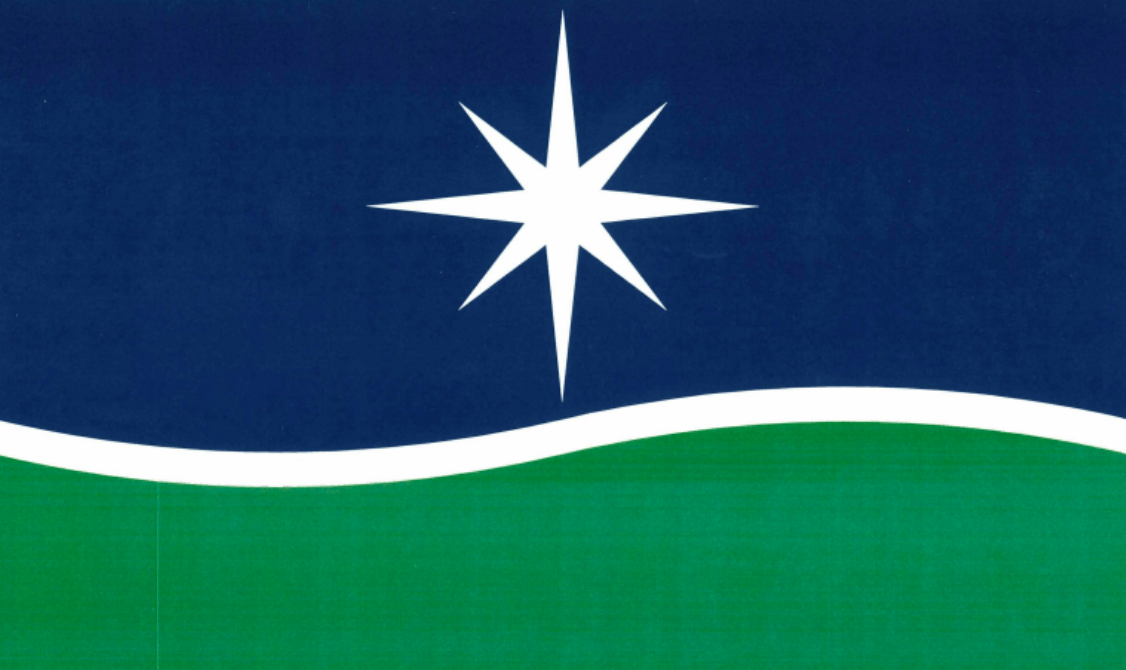
After the snub-of-historical-proportions that was the elimination of the North Star Flag, this minimalist depiction of Polaris is the only remaining flag candidate in contention that I included in my piece four years ago. And maybe it’s familiarity bias, but I kinda love it and I think it’s my pick.
Is this flag perfect? No, probably not. It’s a little tougher to draw than it could be, and it’s pretty limited in symbolism. But honestly? I think this contest showed that Minnesota doesn’t offer up a lot to be symbolized. The people of this great state were directly asked to put forth visual depictions of the state’s geography, history, and culture, and what we learned is that Minnesota is a state of grass, water, exactly one star, and exactly one bird.
Critics of this option argue that it looks too much like a logo and not enough like a flag, but I have to argue that a logo is maybe the preferred outcome. Beyond adorning state-owned buildings, state flags are limited in their utility. Realistically, the best thing we can hope for is a design that looks cool on shirts and backpacks. California, New Mexico, and Maryland all have pretty unconventional state flags and I see those guys all the time. Iowa’s flag is more par-for-the-course and I’ve never seen anyone fly it ever. Going further, this is a state flag. It doesn’t and shouldn’t have to bow to international conventions. Japan’s prefecture flags look like logos and I think that really works for them. Gun to my head, this is my pick. It’s not the only good option, but it’s the only one that feels like it could join the pantheon of flags that outsiders instantly recognize. And ultimately, that’s what matters. It’s all about the clout.
What we learned
Overall, it’s hard not to be a little disappointed looking at the final options, especially having seen the full list of submissions. I’ll admit we probably did need a little bit of handholding, lest we end up with a picture of someone’s dog or a close-up image of wood grain as a state flag, but looking at the options we received, it hurts a little that we didn’t go through a first round of at least twelve or so picks before whittling it down to where we’re at now.
I don’t know that these options are going to get Minnesotans fired up, but I do think we’ll grow to appreciate the eventual winner.
The commission to choose a new state flag and seal has a deadline of the end of the year. They’re holding a meeting open to public comments on December 12th. Please don’t ruin this for me.